Here are the choices:
12:
13:
Favourite Alton Towers Logo?
- Ripsaw Raver
- Member
- Posts: 573
- Joined: Sun Jul 29, 2007 2:50 pm
- Location: Beeston ,Nottingham
- Contact:
7- Simply because "Where the magic never ends" the era of Nemmie-Blivvy Ripsaw and Energizer =]
CHECK OUT MY FLICKR PHOTOSTREAM
http://www.flickr.com/photos/djthorpeimages/
Why is Nemesis Inferno really Inferior
MitchHawker Steel CoasterPoll 2012
Nemesis at #12
Nemesis Inferno at#123
http://www.flickr.com/photos/djthorpeimages/
Why is Nemesis Inferno really Inferior
MitchHawker Steel CoasterPoll 2012
Nemesis at #12
Nemesis Inferno at#123
- cybermen39
- Member
- Posts: 163
- Joined: Wed Jul 08, 2009 9:54 am
I would have gone for Where wonders never cease but its not there. So not a great start to a topic really
- Maseyg123
- Member
- Posts: 91
- Joined: Fri Nov 23, 2012 1:25 pm
- Location: UK
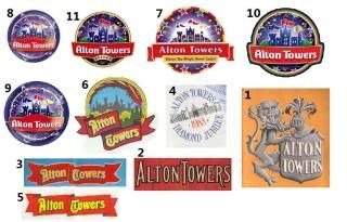
I didn't create the image, there is no Where the wonders never cease logo on Google.cybermen39 wrote: I would have gone for Where wonders never cease but its not there. So not a great start to a topic really
Last edited by Maseyg123 on Sat Mar 30, 2013 11:54 pm, edited 1 time in total.
Credit to lewis97 for the amazing signature above
Hilarious Text Loading...
- Maseyg123
- Member
- Posts: 91
- Joined: Fri Nov 23, 2012 1:25 pm
- Location: UK
I'll add that to the poll for youclayj wrote: By far my favourite logo would be on the Smiler trains...
Now thats how to start an argument you twolol
Credit to lewis97 for the amazing signature above
Hilarious Text Loading...
- cybermen39
- Member
- Posts: 163
- Joined: Wed Jul 08, 2009 9:54 am
There are 4 images of it in the history section under park maps.
- clayj
- Member
- Posts: 202
- Joined: Thu Oct 11, 2012 11:16 pm
- Location: Belfast but Newcastle originally
It's the font as used on the current logoMaseyg123 wrote:I'll add that to the poll for youclayj wrote: By far my favourite logo would be on the Smiler trains...
Now thats how to start an argument you twolol
[align=center]
ɹǝןıɯs ǝɥʇ[/align]
ɹǝןıɯs ǝɥʇ[/align]
- dominicjeffrey
- New Member
- Posts: 19
- Joined: Sat Apr 13, 2013 12:27 am
I must say the current logo with The Smiler theme is my personal favourite. It really suits it.
- Trumpet
- New Member
- Posts: 19
- Joined: Sun Apr 21, 2013 11:41 am
- Location: Cambridge
- Contact:
Thanks for the photo of an old park map. It is amazing how many lands have no goen, such as Thunder Valley
"Science is not an exact Science"
Rick and Morty - 2014
- PeteB
- Member
- Posts: 3500
- Joined: Thu Jul 20, 2006 6:02 pm
- Location: Sunderland
- Contact:
In my opinion, without question this is best logo they ever had. It says everything about the park just looking at it. It was also my favourite time for the park as well.Maseyg123 wrote: 13:
The logo itself looks like its bursting with fun and magic, the tag line "where the magic never ends" sums what towers was all about back then, having the parents company name "Tussauds" above it which is such a well known British brand and kinda works like "Disney's Magic Kingdom, Disney's Hollywood Studios etc. Then to top it off the whole thing is put inside a glass bubble. It's kind of like a metaphor for when people say they're in a "bubble" - nothing exists outside once you're in that bubble, it becomes your world and is total escapism.
That logo was also nicely animated at the end of all their adverts around that time.
Here's a clearer version, just missing the tag line:
Last edited by PeteB on Mon Apr 29, 2013 1:59 am, edited 1 time in total.