
I'll be riding alone but not on park alone as my other half doesn't like coasters, but im gonna keep an eye out for everyoneBen-TT wrote:Why alone? Join the TT meet!nicksy111 wrote:I would have thought so. I'll be there on opening day and riding alone so I hope it will be. I dont see why it wouldn't be thoughladyofthelake wrote: Anyone?
The Smiler - Construction Discussion
-
Dan
- Member

- Posts: 2339
- Joined: Tue Jun 23, 2009 9:08 pm

-
M3tabolic

- New Member

- Posts: 7
- Joined: Fri Nov 09, 2012 8:04 pm
http://dictionary.reference.com/browse/tacky?s=tTheOutpatient wrote: Can people please stop using the word "Tacky" to describe the entrance. That word means something is tacked on, flimsy, thin. I think the entrance is pretty creative but if you don't can you PLEASE use a different, more accurate word.
-
Oblividoom

- New Member
- Posts: 10
- Joined: Thu Apr 25, 2013 4:42 pm
- Location: Marmaldom
I always get excited when I see the small details being added - queue signs, entrance graphics etc.
Lots of people are being very negative about the themeing elements here and I think it's important to remember a couple of things. Firstly, the whole purpose of themeing is to make you look and observe - I'd say the bright colours do more than enough for that! Personally, themeing elements are all about escapism and as far as I'm concerned there's enough themeing here to make me think I've gone a bit doo dah and need to smile...
Remember also that this ride isn't just for now but for the future. It's got to have 'staying power' for the next X number of decades. Everyone criticised London 2012's logo.....but the theme fit perfectly with the style and fashion of 2012 when it arrived.
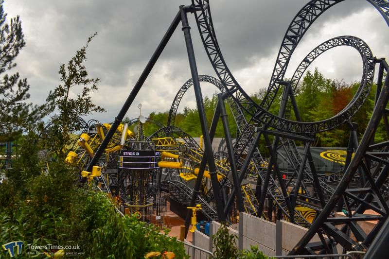
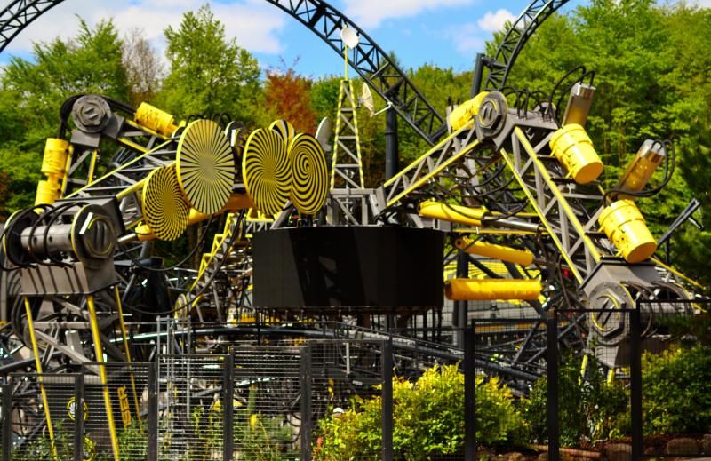
This is such a graceful but sinister looking coaster. It messes my mind just trying to follow the track!!
Lots of people are being very negative about the themeing elements here and I think it's important to remember a couple of things. Firstly, the whole purpose of themeing is to make you look and observe - I'd say the bright colours do more than enough for that! Personally, themeing elements are all about escapism and as far as I'm concerned there's enough themeing here to make me think I've gone a bit doo dah and need to smile...
Remember also that this ride isn't just for now but for the future. It's got to have 'staying power' for the next X number of decades. Everyone criticised London 2012's logo.....but the theme fit perfectly with the style and fashion of 2012 when it arrived.
This is such a graceful but sinister looking coaster. It messes my mind just trying to follow the track!!

-
ManiaMuse
- New Member
- Posts: 26
- Joined: Wed Sep 22, 2010 4:50 pm
The bloodied nurses were from some of their early marketing when I think the design team weren't completely sure of the final creative design of the ride/marmaliser. The initial plans/marketing seemed to suggest a more generic abandoned mental hospital type theme, but since then we have seen it turn into this more colourful, cartoonish theme intent on creating 'smiling advocates' rather than any sort of horror/blood connotations.Kathy wrote:Damn, kinda puts me off now tbh...Kathy wrote:I did see a picture of a bunch of young adults dressed as patients/nurses a while back so I don't know if that indicates something. There was just a little bit of blood on some of the faces!Just a question, I know about actors, none of them are what you'd say to have blood on their faces or anything is there? It'd be a tad embarrassing for me if there is...
Judging by the more recent viral marketing, ride operator uniforms and emphasis on smiling I don't think you should have anything to worry about bloodwise.
-
Wildboy
- Member
- Posts: 175
- Joined: Sun Oct 17, 2010 11:00 am
- Location: Chichester
I
I agree, there is nothing wrong with this theme. A ride this compact could easily have been leveled over with a large rectangle of concrete or gravel and been left. The track itself is providing the eyecandy. Literally every glimpse you get is a feast for the eyes. True, I would have preferred an old 60s testing facility theme but is that not what every maze features nowadays? They have managed to modernise a common theme and they have done it well as far as I can see. It probably cost over a million to construct that spider thing alone.
Oblividoom wrote: I always get excited when I see the small details being added - queue signs, entrance graphics etc.
Lots of people are being very negative about the themeing elements here and I think it's important to remember a couple of things. Firstly, the whole purpose of themeing is to make you look and observe - I'd say the bright colours do more than enough for that! Personally, themeing elements are all about escapism and as far as I'm concerned there's enough themeing here to make me think I've gone a bit doo dah and need to smile...
Remember also that this ride isn't just for now but for the future. It's got to have 'staying power' for the next X number of decades. Everyone criticised London 2012's logo.....but the theme fit perfectly with the style and fashion of 2012 when it arrived.
This is such a graceful but sinister looking coaster. It messes my mind just trying to follow the track!!
I agree, there is nothing wrong with this theme. A ride this compact could easily have been leveled over with a large rectangle of concrete or gravel and been left. The track itself is providing the eyecandy. Literally every glimpse you get is a feast for the eyes. True, I would have preferred an old 60s testing facility theme but is that not what every maze features nowadays? They have managed to modernise a common theme and they have done it well as far as I can see. It probably cost over a million to construct that spider thing alone.
Enjoying Rollercoasters as part of a healthy balanced diet since 1983

-
bbooth2
- New Member
- Posts: 38
- Joined: Fri Sep 25, 2009 5:12 pm
im starting to wonder weather the people crying about the themeing etc of the ride have actually been on the site and looked at it! the thing is very impressive!, i was there yesterday and i heard nothing but positive remarks from the GP nobody was moaning about the fences being too high or the grass not being yellow. never heard so much negativity about something that is genuinely unbelievable to look at.
as ive said before im just gonna go ahead and let all the depressing people moan about it, ill just continue to admire the hard work and attention thats gone into this ride. as that is an adult and mature thing to do.
on another note. is there a car going around today? nobody seems to be noticing that it broke down yesterday and it hasnt been running since??
-
Barty

- New Member
- Posts: 9
- Joined: Sun May 05, 2013 4:42 pm
- Location: Nottingham
Just reading this forum and its starting to get painful to read because of all the negative comments. Will people shut up complaining because there is nothing wrong with it and do you want a new rollercoaster or not? When you go and see it in real life, i hope you regret saying all this bad stuff about it
-
Roodlesnouter

- Member
- Posts: 363
- Joined: Thu Feb 23, 2012 9:17 pm
- Location: Wishing I was in Orlando
- Contact:
Im posting this to show what a great job of theming Merlin have made on this coaster
Im sure you will agree it looks fantastic.
I agree that the station could look better but we are bound to find some faults or not be as happy as we could be with some things, nothing is ever perfect after all. AT staff will be out and about on opening day, and the days after gathering opinions on the ride, use that as a platform to get across constructive critism to get your feelings known.
We also have a few days to go so we may still see some things change, I know we still have netting to go up over certain areas of the queue line. Close season often brings changes to a new ride also, things missed, new ideas or simply running out of time are all ereasond this could happen.
So come on guys lets enjoy what we have and can we please GET BACK ON TOPIC :mrgreen:
Last edited by Roodlesnouter on Sun May 19, 2013 12:40 pm, edited 1 time in total.
http://pixelsattheparks/" onclick="window.open(this.href);return false;
-
LCFCjames
- New Member
- Posts: 33
- Joined: Thu Nov 15, 2012 8:31 pm
- Location: Leicester
I agree that all the theming is brilliant, especially the marmaliser, which in my eyes is possibly one of the best theming element on a coaster in Europe 
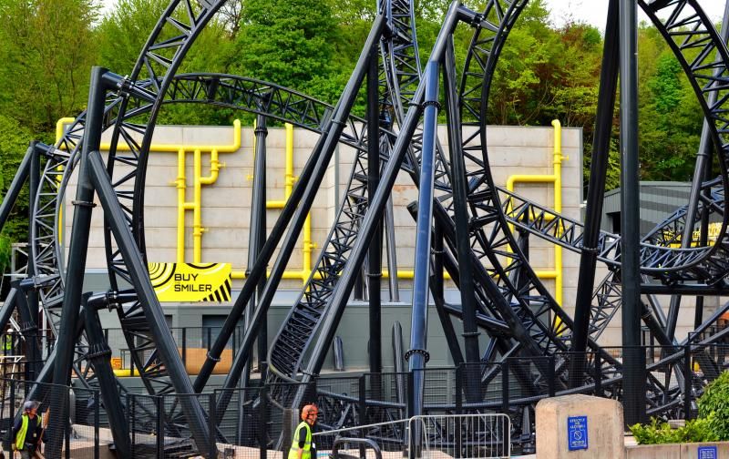
I think the station looks great on the inside, but i think the outside just needs a big painted, yellow Smiler logo where the bare area of concrete is. This would be the icing on the cake, but I don't think it'll happen now. Still even without that this is definitely shapIng up to be the best coaster in the UK by a (s)mile 8)
I think the station looks great on the inside, but i think the outside just needs a big painted, yellow Smiler logo where the bare area of concrete is. This would be the icing on the cake, but I don't think it'll happen now. Still even without that this is definitely shapIng up to be the best coaster in the UK by a (s)mile 8)
-
Kieran141
- New Member
- Posts: 3
- Joined: Fri Mar 01, 2013 8:42 pm
- Location: Leeds
The themeing looks cheap and easily breakable. All the yellow just brightens up X Sector, which is meant to be sinister and secret. The Smiler just doesn't fit in with the whole theme of X Sector! With the station, it looks as if the budget vanished, and then to paint that nasty horrid Smiler logo on the floor as well? Disgusting. Merlin have just invested in theming that will be vandalised and destroyed within ten years.
Last edited by Kieran141 on Sun May 19, 2013 3:22 pm, edited 1 time in total.
-
MatthewR1990

- Member
- Posts: 183
- Joined: Thu May 03, 2012 10:38 pm
- Location: West Bromwich
Hopefully in 10 years time you snap out of such ferocious negativity. £18 million and the most compact coaster in the world and you're moaning because in 10 years time it won't be perfect. It's almost sad. If it annoys you that much, stat away from it. Simple as that.Kieran141 wrote: The themeing looks cheap and easily breakable. All the yellow just brightens up X Sector, which is meant to be sinister and secret. The Smiler just doesn't fit in with the whole theme of X Sector! With the station, it looks as if the budget vanished, and then to paint that nasty horrid Smiler logo on the floor as well? Disgusting. Merlin have just invested in theming that will be vandalised and destroyed within ten years.
Last edited by MatthewR1990 on Sun May 19, 2013 3:22 pm, edited 1 time in total.

West Bromwich Albion until I die! I bleed blue and white.
-
Liam B

- Member
- Posts: 462
- Joined: Wed Jul 06, 2011 4:58 pm
- Location: South Lanarkshire
It's yellow as it's meant to be a cover up of how sinister it actually is! I completely disagree with everything you have said and think it looks amazing. I don't see why you hate it so much. You sound like you just don't want the smiler to be there and wish it never came. fair enough if that is the opinion you're going for but this is an enthusiast website and you really don't seem happy at all!Kieran141 wrote: The themeing looks cheap and easily breakable. All the yellow just brightens up X Sector, which is meant to be sinister and secret. The Smiler just doesn't fit in with the whole theme of X Sector! With the station, it looks as if the budget vanished, and then to paint that nasty horrid Smiler logo on the floor as well? Disgusting. Merlin have just invested in theming that will be vandalised and destroyed within ten years.
Last edited by Liam B on Sun May 19, 2013 3:22 pm, edited 1 time in total.
-
bbooth2
- New Member
- Posts: 38
- Joined: Fri Sep 25, 2009 5:12 pm
dont go on it then mate simple as that, have you ever purchased anything that hasnt been run down in ten years?Kieran141 wrote: The themeing looks cheap and easily breakable. All the yellow just brightens up X Sector, which is meant to be sinister and secret. The Smiler just doesn't fit in with the whole theme of X Sector! With the station, it looks as if the budget vanished, and then to paint that nasty horrid Smiler logo on the floor as well? Disgusting. Merlin have just invested in theming that will be vandalised and destroyed within ten years.
Last edited by bbooth2 on Sun May 19, 2013 3:23 pm, edited 1 time in total.
-
arsenalfan-1

- New Member
- Posts: 25
- Joined: Fri Feb 08, 2013 6:37 pm
Maybe even best in the world? I have never seen a theming element that looks this good and provides such good near-misses! :mojLCFCjames wrote: I agree that all the theming is brilliant, especially the marmaliser, which in my eyes is possibly one of the best theming element on a coaster in Europe
I think the station looks great on the inside, but i think the outside just needs a big painted, yellow Smiler logo where the bare area of concrete is. This would be the icing on the cake, but I don't think it'll happen now. Still even without that this is definitely shapIng up to be the best coaster in the UK by a (s)mile 8)

Thanks Lewis97
-
dazza4783
- Member
- Posts: 375
- Joined: Wed Oct 10, 2012 5:58 pm
- Location: Here
I think the theme fits fine, it is a sinister testing facility, which is trying to come across as smiley and joyous, which makes it even more creepy.Kieran141 wrote: The themeing looks cheap and easily breakable. All the yellow just brightens up X Sector, which is meant to be sinister and secret. The Smiler just doesn't fit in with the whole theme of X Sector! With the station, it looks as if the budget vanished, and then to paint that nasty horrid Smiler logo on the floor as well? Disgusting. Merlin have just invested in theming that will be vandalised and destroyed within ten years.
Also, if you watch the videos it looks like the other rides in X-Sector were previous forms of treatment by the MOJ, i.e "Don't Look Down Miles" and "Your mind, your body is sliding into submission", but these only achieved 50% marmalisation. Now the smiler is opening to complete the process, to correct everyone who is only 50% marmalised, i.e everyone who has been on Oblivion, Submission & Enterprise, and turn them into smiling advocates.
I think it works great, and also ties the whole of X-Sector in nicely to the back story.
Last edited by dazza4783 on Sun May 19, 2013 3:23 pm, edited 1 time in total.

-
MatthewR1990
- Member
- Posts: 183
- Joined: Thu May 03, 2012 10:38 pm
- Location: West Bromwich
Can I just add that the yellow of the Smiler links in with the other rides, in that they all have their own colour codes. oblivion is Orange, Submission blue, Enterprise green.
Light bulb moment. Could these "previous MOJ experiments" be the reason for the rainbow staircase in the station?
Light bulb moment. Could these "previous MOJ experiments" be the reason for the rainbow staircase in the station?
West Bromwich Albion until I die! I bleed blue and white.
-
LCFCjames
- New Member
- Posts: 33
- Joined: Thu Nov 15, 2012 8:31 pm
- Location: Leicester
The only reason I didn't say the best in the world was because of Disneyarsenalfan-1 wrote:Maybe even best in the world? I have never seen a theming element that looks this good and provides such good near-misses! :mojLCFCjames wrote: I agree that all the theming is brilliant, especially the marmaliser, which in my eyes is possibly one of the best theming element on a coaster in Europe
I think the station looks great on the inside, but i think the outside just needs a big painted, yellow Smiler logo where the bare area of concrete is. This would be the icing on the cake, but I don't think it'll happen now. Still even without that this is definitely shapIng up to be the best coaster in the UK by a (s)mile 8)
But in terms of overall interaction with the rider I think it could be the most technically impressive in the world.
Going back to construction I guess the final days leading up to opening will be centred on the indoor section. We know that there will be some sort of effects in that area, primarily the strobe lights. We didn't see any evidence of these elements on any of the POV's so far, so I guess they will be installed this week, to leave the elements as a surprise. 8)
-
dazza4783
- Member
- Posts: 375
- Joined: Wed Oct 10, 2012 5:58 pm
- Location: Here
I think it is just a case of you are supposed to come off the ride happy, so at the end of the ride you would be "over the rainbow", or that is what i took it to mean anyway.MatthewR1990 wrote: Can I just add that the yellow of the Smiler links in with the other rides, in that they all have their own colour codes. oblivion is Orange, Submission blue, Enterprise green.
Light bulb moment. Could these "previous MOJ experiments" be the reason for the rainbow staircase in the station?