
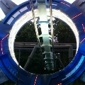
Blackpool Pleasure Beach


-
smeg_head
- Member

- Posts: 691
- Joined: Wed Apr 28, 2004 11:16 pm
- Location: Quahog
- Contact:
I give it a season before mr funshine returns. These 'trendy' corporate makeovers never seem to work. Look at Abby National's recent relaunch - a complete flop.

-
Redcoat Jase

- Member
- Posts: 1618
- Joined: Mon May 31, 2004 10:49 am
You may already know this, or you may not, but Blackpool Pleasure Beach have this year decided to scrap smiley My Funshine for a rather dodgy looking logo.
CLICKY
Personally, I'm sad to see him go, but just like our beloved AT things change.
What do you think?
CLICKY
Personally, I'm sad to see him go, but just like our beloved AT things change.
What do you think?
...is no longer a member of TowersTimesForum
-
Anonymous
Absolute cr*p of a logo!
Funshine was practically a trademark for BPP and they've replaced it for something that looks like it was done by someone on Work Experience using paint!
Sunshine may be a little cheesy looking, but heck its a theme park! And that is just a poor replacement.
Funshine was practically a trademark for BPP and they've replaced it for something that looks like it was done by someone on Work Experience using paint!
Sunshine may be a little cheesy looking, but heck its a theme park! And that is just a poor replacement.
-
Williscroft
Although im sad to see Mr Funshire go i do actualy like the new logo, i think it looks rather smart and fresh and im glad the pleasure beach are going for a more snazzy look. The only thing i would of done different was have the dot as the Mr Funshine logo as it would of added a bit of detail and colour to it. 
-
Nathan
- Member
- Posts: 1372
- Joined: Sun Oct 30, 2005 5:18 pm
- Location: Sunderland
- Contact:
I like the new logo as its clean, crisp and easy recogniasble. Anyway Mr Funshine wont be gone for good, there will always be some sign about showing his face and there moulded on the lamposts outside 
-
Sazzle
I heard this ages ago - I would have posted it but I though it was already here  .
.
Apparently they're having it as neon lights and stuff, so will look pretty ace when lit up.
Also its no longer Blackpool Pleasure Beach, its Pleasure Beach, Blackpool.
Doesn't have the same ring, I find. . .
Apparently they're having it as neon lights and stuff, so will look pretty ace when lit up.
Also its no longer Blackpool Pleasure Beach, its Pleasure Beach, Blackpool.
Doesn't have the same ring, I find. . .
-
Crofty
Its also the nations number one tourist attraction with over 6 million visitors last season
Don't like the new logo much although I didn't really like the old one either :P
Don't like the new logo much although I didn't really like the old one either :P


-
sammie04
I think both logos aren't brilliant but I much prefer Mr Funshine because its more of a trademark for Blackpool Pleasure Beach .
-
Redcoat Jase
- Member
- Posts: 1618
- Joined: Mon May 31, 2004 10:49 am
Get it right Sammie! lmao - It's Pleasure Beach, Blackpool now! lol :P
...is no longer a member of TowersTimesForum
-
Adam

- Member
- Posts: 3965
- Joined: Fri Apr 09, 2004 1:07 pm
- Location: UK
You can see the new logo and new site online now. . . http://www.blackpoolpleasurebeach.com/
Reminds me of a simple version of Alton Towers' site.
Reminds me of a simple version of Alton Towers' site.
"It would be spiteful to put Jellyfish in a trifle..."
-
Wes

- Member
- Posts: 5257
- Joined: Mon Apr 04, 2005 8:03 pm
- Location: Cornwall
- Contact:
The old Logo is TACKY with all Capitals, becuase it really is. It belongs with . . . . Dare I say it, Butlins
The new logo is very Modern and has been put into the shape of a . . . ! . . . Which is trying to set a statement and it really does.
Seems they are edging away from the rest of blackpool and getting with the Modern times.
The new logo is very Modern and has been put into the shape of a . . . ! . . . Which is trying to set a statement and it really does.
Seems they are edging away from the rest of blackpool and getting with the Modern times.
-
Redcoat Jase
- Member
- Posts: 1618
- Joined: Mon May 31, 2004 10:49 am
BUTLINS LOGO IS NOT TACKY!  lol
lol
There's loadsa tacky logos about, you only said Butlins because it winds me up! lol

I really don't like the new logo! - As someone quite rightly said, It's high graphics made with the latest MS Paint!
There's loadsa tacky logos about, you only said Butlins because it winds me up! lol
I really don't like the new logo! - As someone quite rightly said, It's high graphics made with the latest MS Paint!
...is no longer a member of TowersTimesForum
