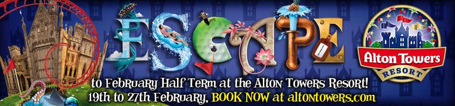
It's not bad, but I much preferred the branding of this last few years, I hate what they've done to the Towers in the banner, and why can't the Vekoma track be purple? The way they've done "escape" with the letters representing different aspects of the resort is very clever, but I'm not sure about it yet. I also hate the font used under the word escape, just seems cheap. I'm sure it will all grow on me though!
[quote=""Ritadz""]I think it's very good, but i hope this doesn't mean they'll have a new map design for 2011.[/quote]
Well they usually redo the map every few years or so, is it 4 years they have had this "new" design? I really don't like it I adored the cube design that preceded it, I really hope they do a new one this year!
Yeah me too actually. It's defiantly about time for a new one. Think it's pretty safe to say we will get a new website this year too matching the new branding.
"It would be spiteful to put Jellyfish in a trifle..."
[quote=""chip""]I love the font, kinda reminds me of the weird not quite right font of years gone by. What they have done to the towers though!?!?!?!?! *Bleurgh*[/quote]
They do look really awful, they look like they are about to explode or something, it's a shame really, it is a really poor poster, naff font, naff towers ... It's generally naff!
The Towers in that promo look awful, along with the corkscrew red rollercoaster (I hate it when they use rides that don't exist) and the tacky, word art style text underneath. However I suppose I am glad they have stopped using that same golden font they used on literally EVERYTHING from 2008, which was getting boring.
I do though on the other hand love the ESCAPE part showing the aspects of the resort, and maybe we will get a new website based around it? Hopefully it will be better designed with improved navigation and a more flowing design. Although I do rather like the present homepage, except the cardinal design sin they have committed by using Times New Roman or similar text for the heading... [-X
I quite like it. What's great is a more of an evolution of the last years branding instead of a massive jump to something completely different which was happening every year prior.
I think we'll still see the golden font on general posters. It's a great style and they've used it loads around the park on general signage so it would be stupid to ditch it completely!
One thing I do like and I forgot to mention this earlier is the Alton Towers Turret wallpaper in the background. I am going to try and get that in my house!
I do like the "Escape" but I find it annoying and awkward to read, the colours clash in places and looks a bit rough and ready in places, but I like the idea behind it. It looks new(ish) and sort of brings back the older Towers stile a little bit.
... I still dislike everything else though, and thinking about it, when does Air do the maneuver it does in the image?
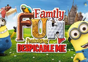
It is good to see Mr. T is still riding Air too, you think somebody would have let him off by now!
Really like those images. Nice and bright. It looks like the background on the first one is sort of like Towers Nerds logo.
Is it just me though? "Escape to February Half Term?" Doesn't make sense.
I quite like it. It's a fresh take on the logo and gives it a new lease of life. But I swear I saw this exact same leaflet knocking around the Park during Scarefest? Or was that just me?
I think this is a bad move. Their current branding is how I see Alton Towers. It works in my opinion how it is and looks nice and colourful, no need to change it. It seems like they are changing it again just for the sake of changing it again. Is there really any need?
Of course, I wouldn't mind if the new branding actually looked nice. Revolting clash of colours and awful use of green daisy meadows that just screams "GENERIC". No me gusta.
I hope I change my mind when the full promo images come out, though. I will definitely miss the current branding, though, especially the maps. The maps are just awesome how they are in my opinion, so full and colourful.
EDIT
I just noticed the octopus and shark in the corner of the first image. Why on Earth are they still pushing Sharkbait Reef?!? It's only a 3 year old Sea Life centre! What about Nemesis, Oblivion, Air, Rita, Thirteen, Katanga, Hex, Duel or the Gardens? Don't any of them represent Alton Towers more than Sharkbait Reef?
Last edited by [Archive] on Sat Jan 15, 2011 11:05 am, edited 1 time in total.
I think this new design is acceptable, nothing offensive in my opinion, however i think in 2008 the pipes theme was used wayyyyy to much, with literally pipes on all promotional materials and maps etc, but over 2009/2010 i believe they have got the branding just right, still continuing with the pipes look, but in a subtle and proffesional looking way.
If they do get rid of the pipes theming completely - the entrance sign is gonna look a bit silly though surely :P
---- Post Info Added ----
I think this new design is acceptable, nothing offensive in my opinion, however i think in 2008 the pipes theme was used wayyyyy to much, with literally pipes on all promotional materials and maps etc, but over 2009/2010 i believe they have got the branding just right, still continuing with the pipes look, but in a subtle and proffesional looking way.
If they do get rid of the pipes theming completely - the entrance sign is gonna look a bit silly though surely :P
[quote="".Will""][quote=""Ritadz""]I think it's very good, but i hope this doesn't mean they'll have a new map design for 2011.[/quote]
Well they usually redo the map every few years or so, is it 4 years they have had this "new" design? I really don't like it I adored the cube design that preceded it, I really hope they do a new one this year!
[/quote]
I hated the cube design... I thought it was awful, it's what alton Towers would like like if made out of Duplo or in Habbo Hotel... I was so glad when they got rid of it!
I'm very much hoping for a more 200(2/3?)-esque design, where the rides had more accurate detail to them and there wasn't anything unnaturally large, or anything to stupid looking... very similar to the Disneyland style map